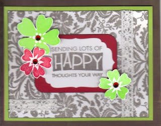
Lime green, red and gray are certainly not my go to colors for cardmaking. Here is the challenge photo for Play Date Cafe:
My card features stamps from Hero Arts.
The fabric background stamp and the sentiment were stamped with Ranger Adirondack slate ink. I heat embossed the flowers and added red gems to the centers. The lace accents are from Hero Arts also. A nestabilities die was mounted on red cardstock, which is brighter IRL than in this scan.
This was indeed a challenge, but a lot of fun.
TFL!


5 comments:
Love that gray background with those vibrant flower accents! Great job with our colors! So glad to have you playing along with us at the Play Date Cafe!
love how you used those colors. very pretty card!
Yes, sometimes a color scheme can be daunting. It took me a little while to come up with something for this, too, but I love challenging myself! I like very much that damask background you stamped, and layered on those pretty flowers. THanks for playing with us at THe Play DAte CAfe!
Some colour schemes are a challenge, I find pastels really quite tricky, but you've done a great job! Love how you've done the little flowers around the frame. Thanks for playing along with us at Play Date Cafe!
Love that you took on the challenge! Great idea to emboss those flowers, they really pop on that background. Thanks so much for playing along at The Play Date Cafe.
Post a Comment